Rebranding Carroll: A New Look With a New Logo
A logo is an indisputably important, and deceptively simple, element of an organization’s marketing endeavors. It’s an integral part of their brand, perhaps the most impactful means of recognition that’s used in all manner of materials, from billboards and brochures to clothing and commercials. McDonald’s golden arches, Starbucks’ mermaid, Apple’s apple—people instantly associate these designs with the organization they represent.
In short, logos are a powerful symbol of identity.
When Carroll Community College’s Art Director Tara Barnabei suggested the College logo needed a refresh, a Logo Redesign Committee was formed. Helmed by Barnabei and Graphic Designer David Hodgson, the committee, which also included representatives from different areas of the College as well as Carroll students, dove into conceptualizing a new logo design. The challenge they faced wasn’t just figuring out what the logo would look like, but why it should look like that.
To chart a direction for the new logo, the committee, in conjunction with Baltimore marketing agency idfive, first conducted research using focus groups composed of Carroll staff, current and prospective students, and parents. Participants in all groups spoke with great enthusiasm about their experiences at Carroll as well as its campus and staff. Participants also voiced concerns that the current logo was not unique or memorable, something the committee vowed to improve upon.
Based on the focus groups, the designers identified two potential sources of imagery:
- Support: participants said they felt cared for and supported at Carroll.
- Architecture: participants had strong feelings of nostalgia for the College and appreciation for the beauty of its architecture.
The designers next went to work on shaping these sources of inspiration into something that would effectively represent Carroll. “We really wanted the new logo to resonate with our community,” said Barnabei. “Throughout the process, we found that students, staff and visitors to campus have a very strong sense of pride for Carroll, but that the current logo didn’t reflect that energy.”
A few months later, they presented a variety of logo concepts to the College’s Executive Team as well as other stakeholders on campus. After a couple of more months refining these concepts based on feedback received, the new design was finally approved by Carroll’s Board of Trustees.
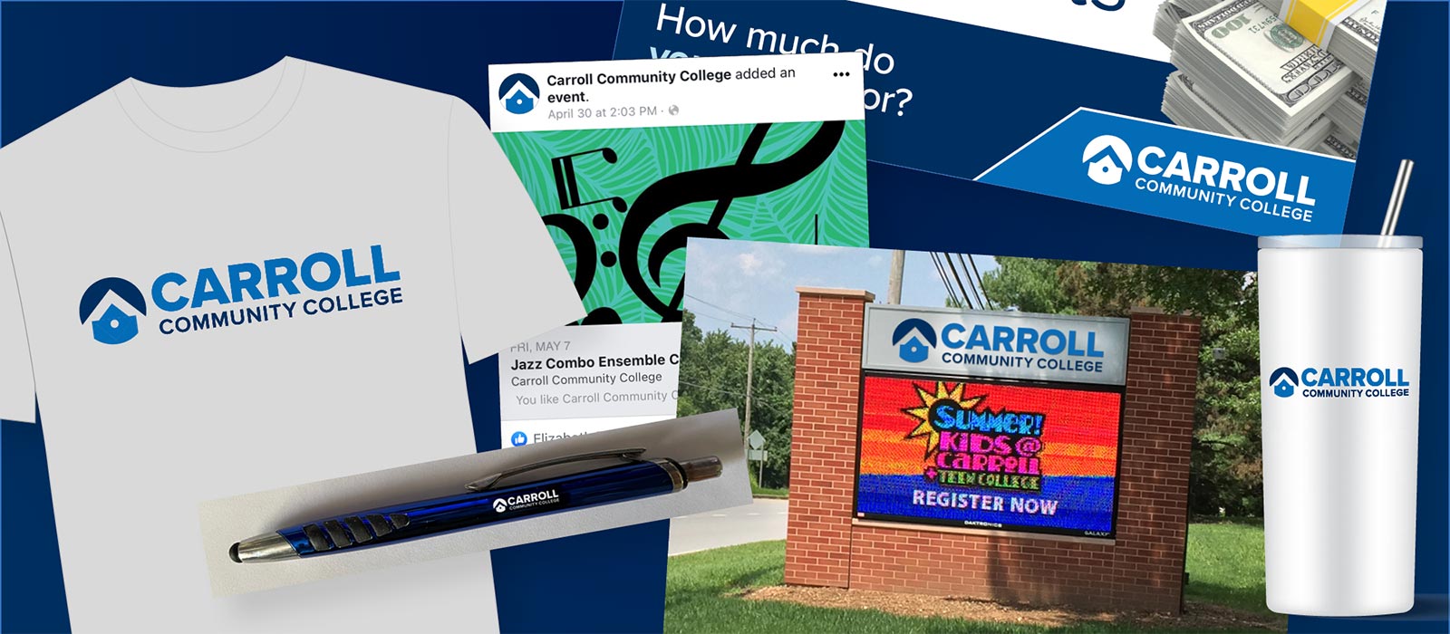
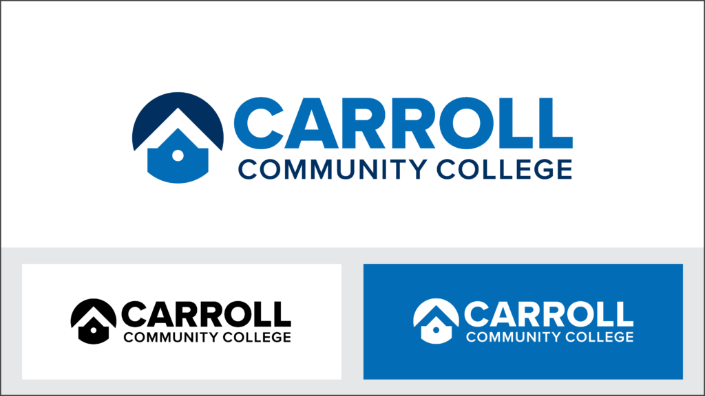
The new logo, publicly unveiled in June 2021, skillfully showcases several different elements, including:
- Carroll’s iconic Babylon Great Hall and its circular window
- Symmetry and bold shapes to evoke the feeling of stability/support
- A sense of upward motion, like an arrow aimed at the sky, symbolizing one’s ascent in their educational journey
- A clean, modern design with a contemporary font
- Black color of old logo replaced with navy blue for a fresher, friendlier look
- The letter “C” representing both Carroll and community
“Getting to be a part of creating Carroll’s new logo was an honor for me,” said Hodgson. “As a designer, rebranding and logo development is the most exciting part of the job, watching one’s creation come to life and ultimately take its place in the institution’s history.”
“Carroll’s new logo succeeds at both representing the College’s celebrated architecture and reflecting its dynamic and supportive personality,” said Dr. James Ball, President of Carroll Community College. “That’s a powerful symbol of identity indeed, one that Carroll can display proudly for many years to come.”