Visual Expression of the Carroll Brand
The Carroll Community College brand is clean, fresh, and vibrant. Below you will find the essential elements of our brand, from color palettes and typefaces to layout and photography. Adhering to the standards outlined ensures a consistent and approachable presence across all platforms.
Logos
Primary Logo
The Carroll Community College logo should appear on all print and digital communications for external audiences, and all internal communications that require a more formal approach.
The full-color primary Carroll logo is preferred and should be used whenever possible. The correct usage of the logo and logo system is mandatory across all pieces of collateral. The logos should be used exactly as specified, and should not be manipulated or altered.
Stacked Logo
The primary logo is always preferred. However, the stacked logo may be an alternative for certain designs and layouts.
Clear Space & Minimum Size
Clear Space
A minimum “clear space” equal to the height of the large “C” vertically and width of the large “C” horizontally must be incorporated into any design using the logo.

Minimum Size
Logos require a minimum size to ensure maximum legibility and to keep the Carroll brand integrity intact. The primary logo may be reduced only to a minimum of 1 inch in print and 72 pixels wide in digital.

Improper Usage

Do not alter or inverse colors.

Do not stretch or skew.

Do not rotate, angle, flip, or pivot.
Do not apply a drop shadow, outline, or other effects.

Do not add or remove any elements

Do not change the scale or ratio of the elements.
Do not place over areas in a photo that may obscure it.

Do not alter the hierarchy.
Palette
Primary
When color is used in print or digital communications, Carroll Blue should be the dominant color where possible. A web alternate is provided to ensure text meets contrast accessibility requirements.

Carroll Blue
Pantone: 660
HEX: #3d7cca
RGB: 61 / 124 / 202
CMYK: 76 / 47 / 0 / 0
Web Alternate
HEX: #2e76cd
RGB: 46 / 118 / 205

Carroll Navy
Pantone: 654
HEX: #003a70
RGB: 0 / 58 / 112
CMYK: 100 / 84 / 31 / 17
Secondary & Tertiary Colors
The extended palette of secondary and terriary colors complement the primary color, and should be used for a range of elements including graphic accents, some type treatments, backgrounds, buttons, and more. Improper use of the these palettes can dilute the Carroll brand.
Tertiary colors are contrasting and more saturated, and should only be used as accent colors.
Secondary

Berry
Pantone: 7648
HEX: #9d1d64
RGB: 157 / 29 / 100
CMYK: 37 / 100 / 34 / 9

Marigold
Pantone: 7409
HEX: #f4b223
RGB: 244 / 178 / 35
CMYK: 3 / 32 / 100 / 0

Tropical Blue
Pantone: 320
HEX: #0099a8
RGB: 0 / 153 / 168
CMYK: 100 / 11 / 38 / 0
Web Alternative
HEX: #00B6C2
RGB: 0 / 182 / 194
Tertiary

Apple
Pantone: 376
HEX: #80bc00
RGB: 128 / 188 / 0
CMYK: 56 / 3 / 100 / 0

Pumpkin
Pantone: 158
HEX: #ee7623
RGB: 238 / 118 / 35
CMYK: 3 / 66 / 99 / 0
Web-Only Text Colors
A “near-black” is used for body copy and button text on the web. This can also be used for text requiring higher contrast.

Near-Black
HEX: #242424
RGB: 36 / 36 / 36
Brand Fonts
Primary Brand Font
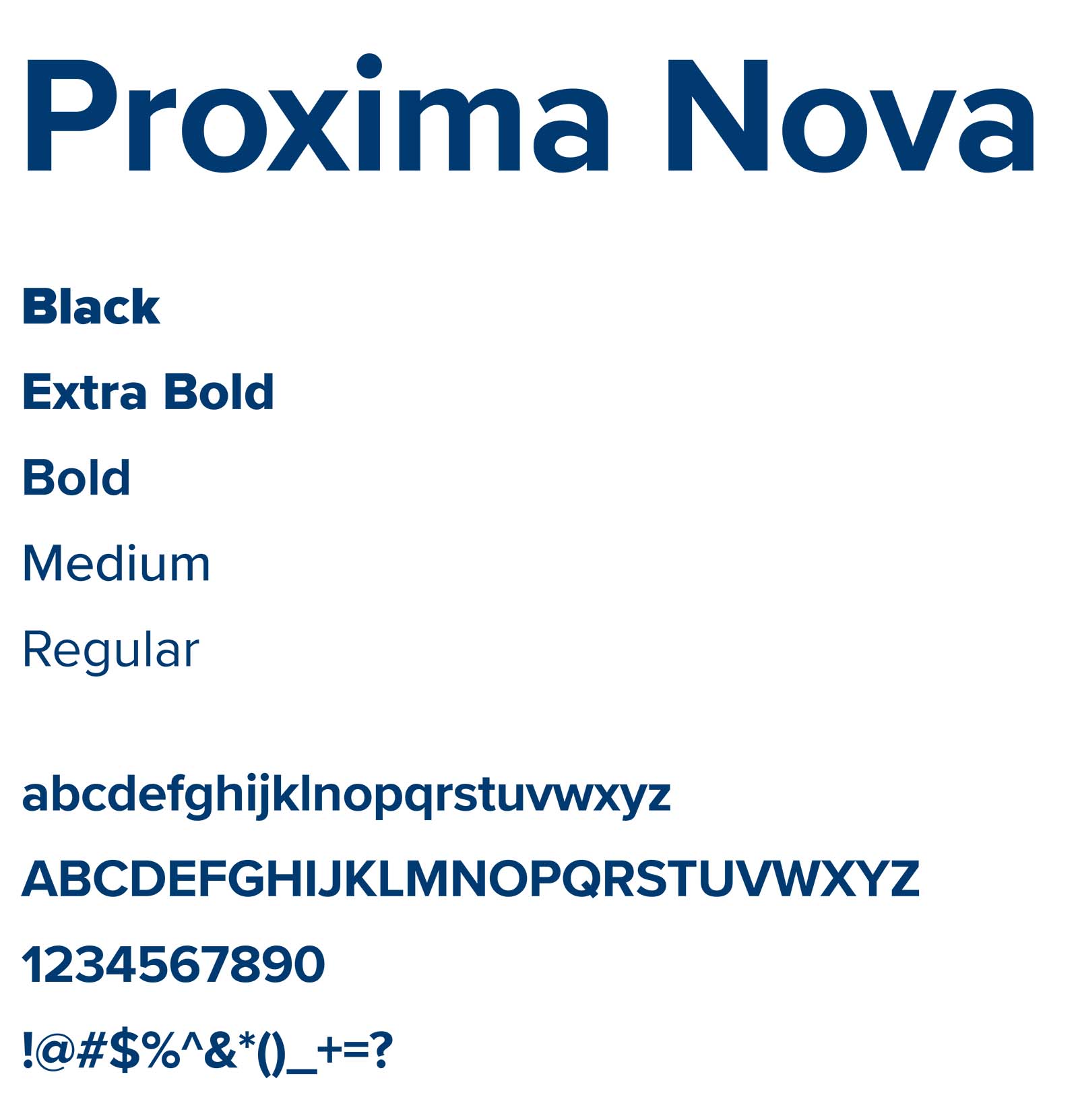
Primary Brand Font
Proxima Nova should be used whenever possible in Carroll communications. When in doubt, use this.
Secondary Brand Font
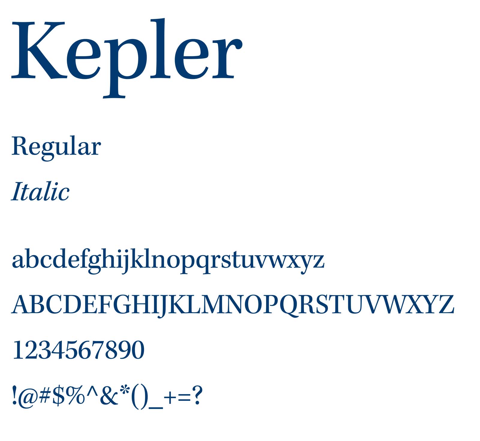
Secondary Brand Font
Kepler should be used sparingly for emphasis, or for special text such as captions, quotes, and dates.
Web/Substitute Fonts
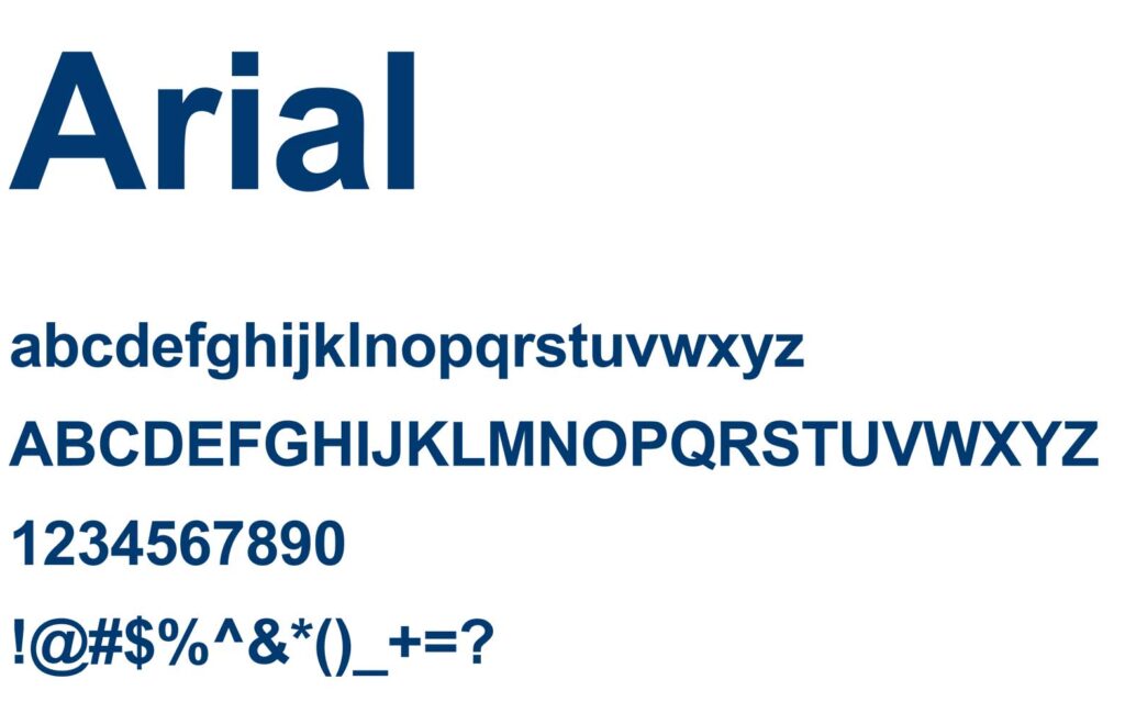
Text here about Arial/Proxima Nova alternate.
Kepler Alternate
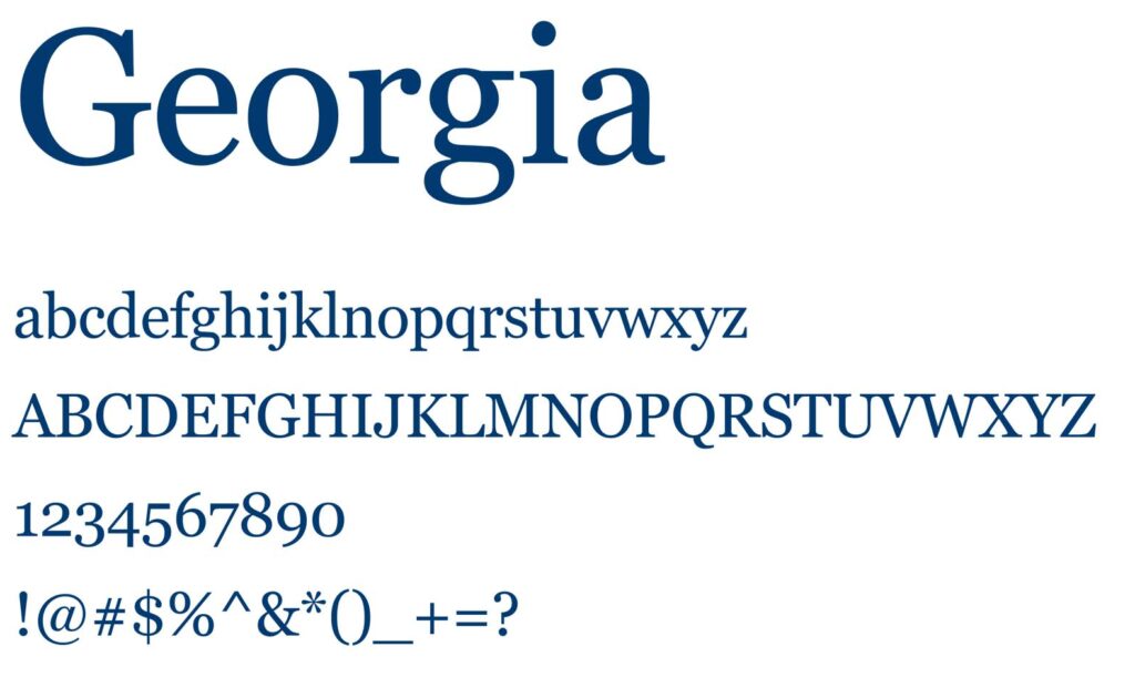
Text here about Georgia/Kepler Alternate.
Character Art
Subheading

Text
Subheading

Text
Subheading

Text
Subheading

Text
Subheading

Text
Subheading
Text.
Subheading

Text