Style Guides: Logos
Logo
Primary Logo

The Carroll Community College logo should appear on all print and digital communications for external audiences, and all internal communications that require a more formal approach.
The full-color primary Carroll logo is preferred and should be used whenever possible. The correct usage of the logo and logo system is mandatory across all pieces of collateral. The logos should be used exactly as specified, and should not be manipulated or altered.
Additional Logos
Stacked Logo

The primary logo is always preferred. However, the stacked logo may be an alternative for certain designs and layouts.
Icon
The Carroll icon on its own isn’t a recognizable symbol and should be used sparingly when space doesn’t allow the minimum logo size — for example as a social media profile picture. The icon can be used as a standalone design element if the primary logo is also being used as the recognizable brand element.
Clear Space & Minimum Size
Clear Space

A minimum “clear space” equal to the height of the large “C” vertically and width of the large “C” horizontally must be incorporated into any design using the logo.
Minimum Size

Logos require a minimum size to ensure maximum legibility and to keep the Carroll brand integrity intact. The primary logo may be reduced only to a minimum of 1 inch in print and 72 pixels wide in digital.
Color Variations
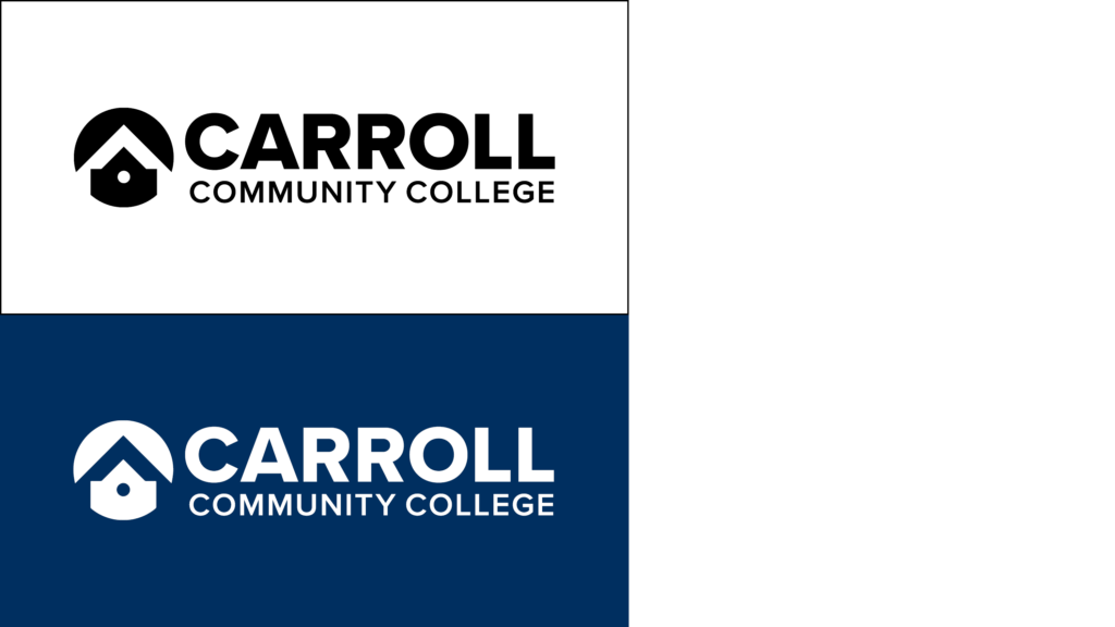
The above additional color options of the primary logo can also be used as needed based on design and medium.
In rare instances where one-color printing is required and the color choice is outside our control (e.g., sponsorship swag such as a 5K race shirt), the logo may be printed in the available color of the piece.
Hierarchical Logos

Occasionally, it may be appropriate to add text below the Carroll Community College logo to identify a specific department or group within the College. Always check with Strategic Marketing & Brand Management before adding any text below the College logo.
Carroll Lynx Athletics Logos
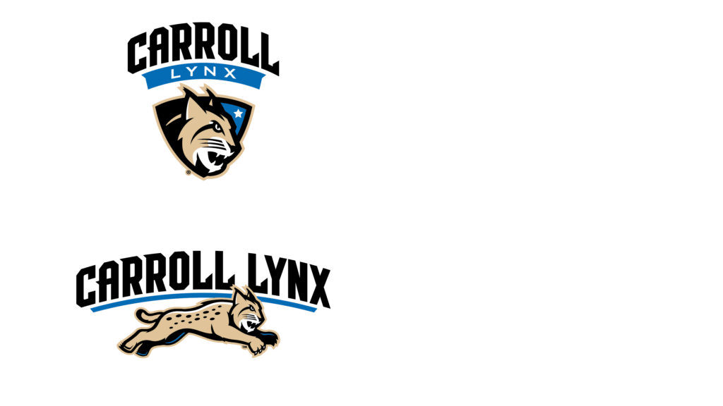
The athletics brand is a dynamic extension of Carroll’s core identity, capturing the energy, competitiveness, and spirit of sports culture. While the college brand reflects Carroll’s academic mission and institutional values, the athletics brand emphasizes team pride, fan engagement, and high-performance impact.
Each logo serves a distinct role within Carroll’s brand architecture. The college logo is reserved for formal, academic, and administrative use, while the athletics logo is intended solely for sports-related materials and environments. Using the athletics logo in place of the college logo can compromise brand clarity, misrepresent institutional identity, and create confusion across audiences. Adhering to proper usage safeguards the professionalism and integrity of Carroll’s visual system.
For full guidelines, refer to the Carroll Lynx Athletics Brand Standards document.
Improper Usage
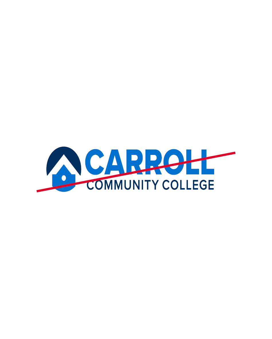
Do not stretch or skew.
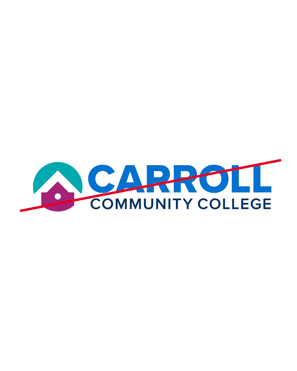
Do not alter or inverse colors.
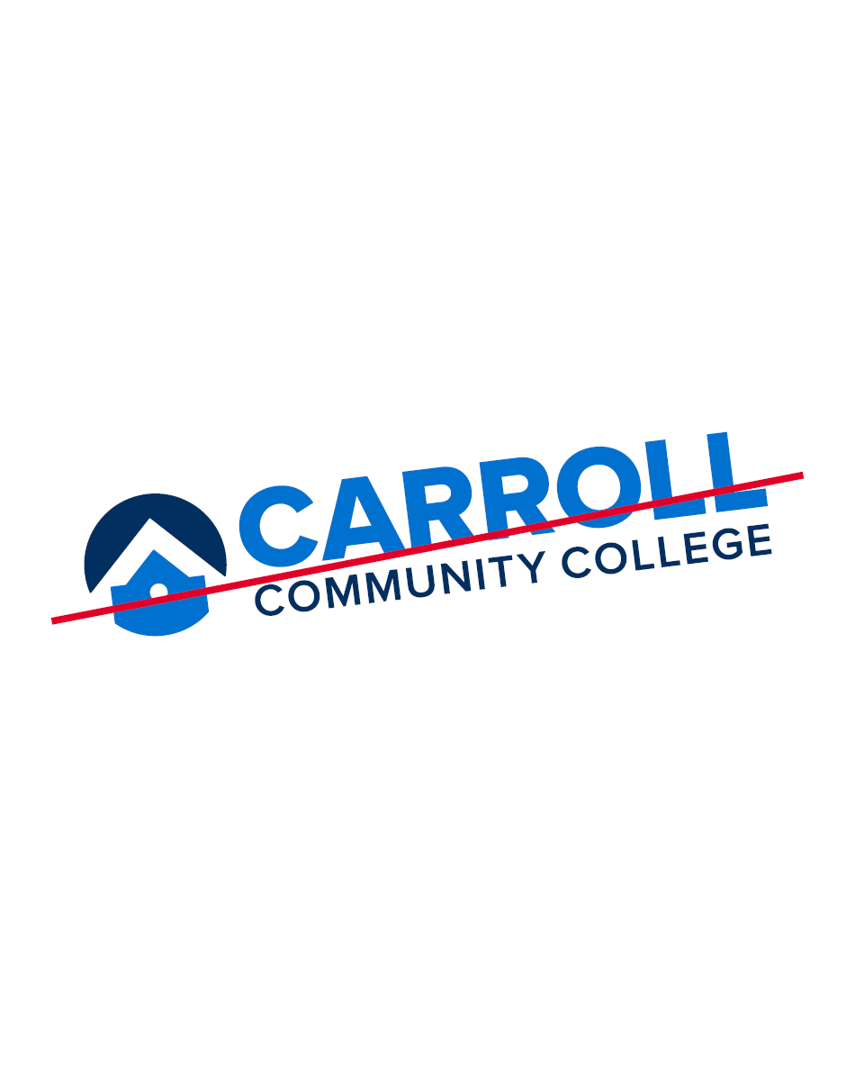
Do not rotate, angle, flip, or pivot.
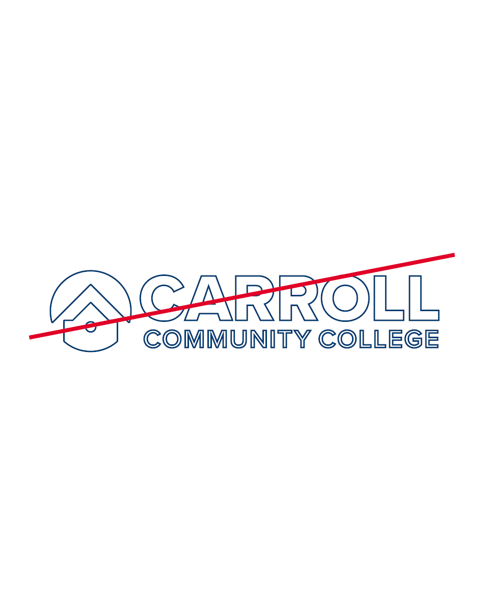
Do not apply a drop shadow, outline, or other effects.
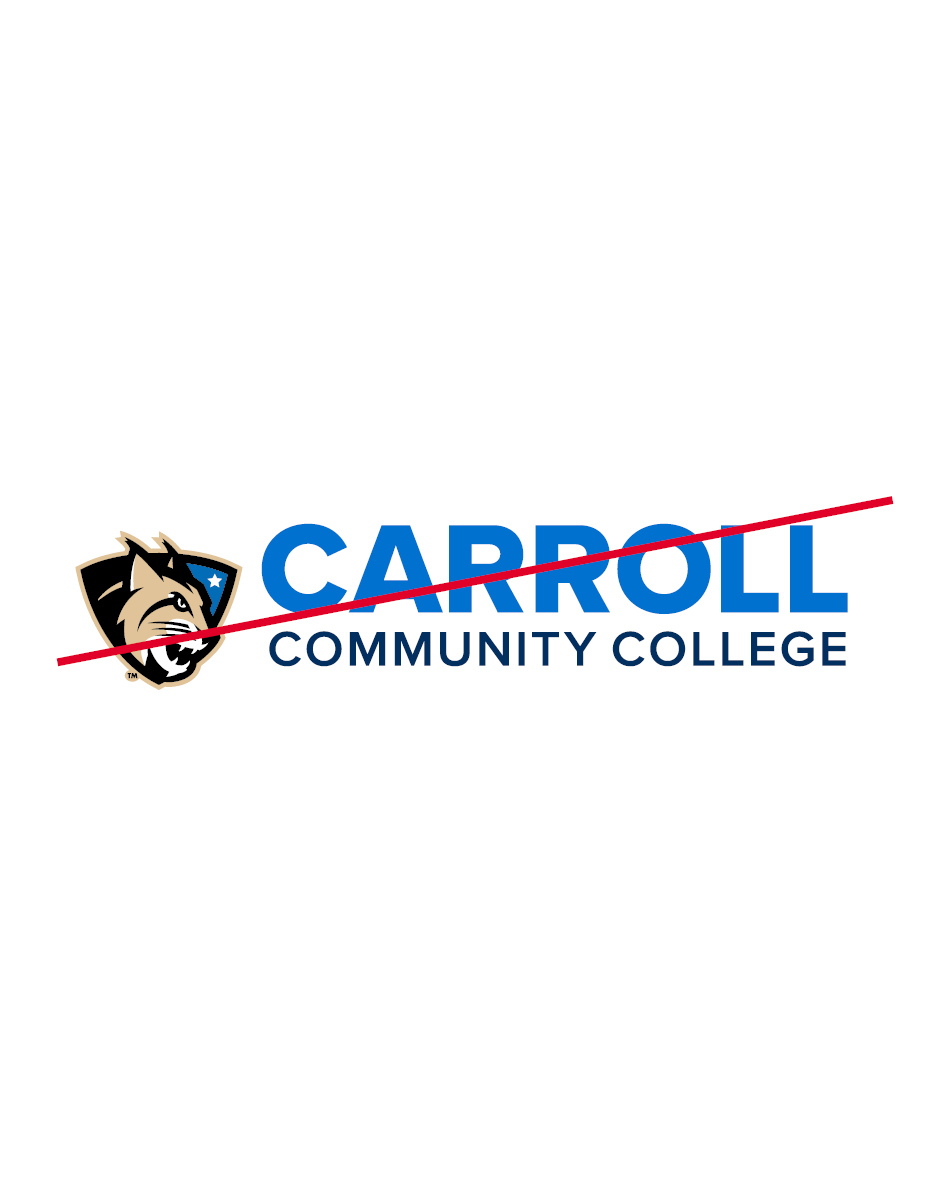
Do not add or remove any elements.
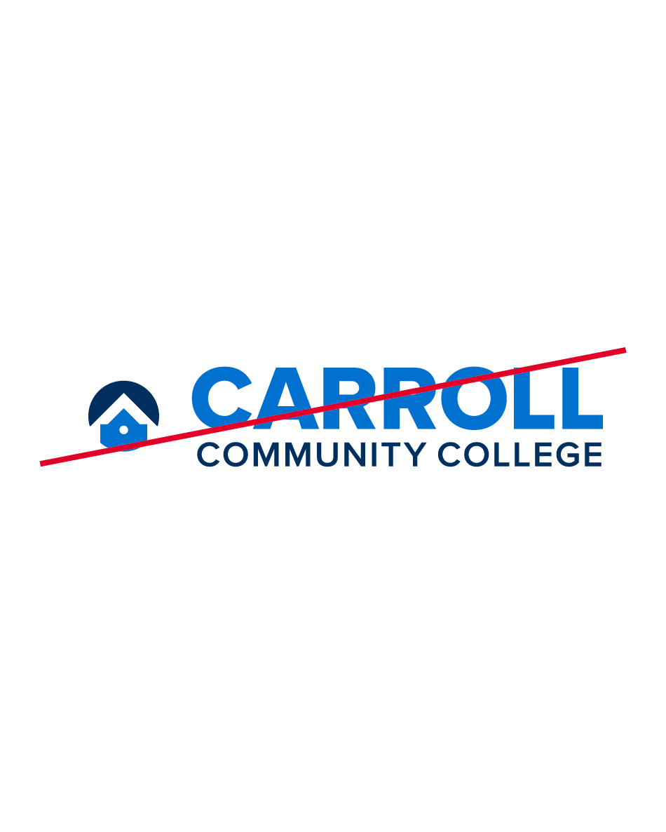
Do not change the scale or ratio of the elements.

Do not place over areas in a photo that may obscure it.
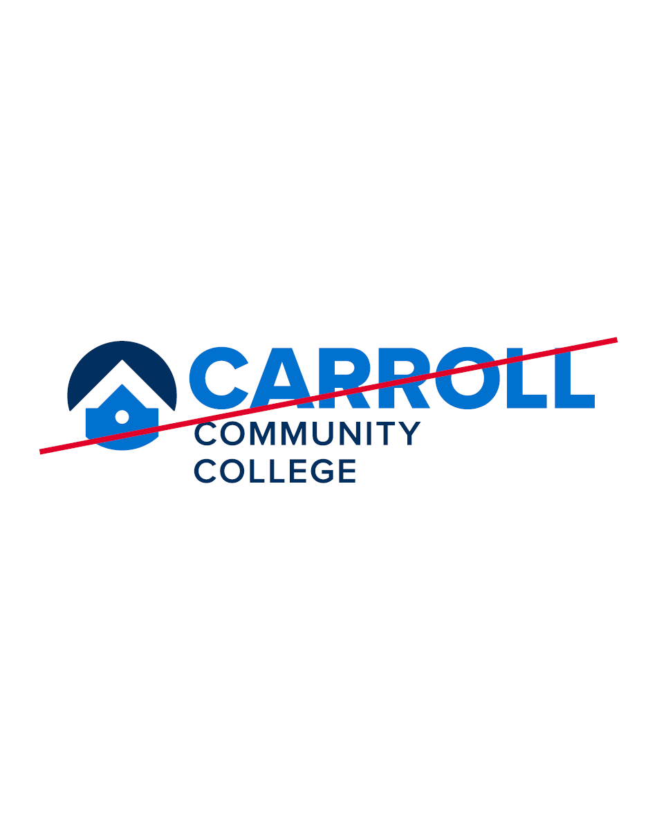
Do not alter the hierarchy.